Chicago Tap Theatre
Chicago Tap Theatre (CTT) is a non-profit 501(c)3 with a multifaceted purpose to preserve America's indigenous dance form, to promote that dance through story-based shows and innovative presentations, to educate the community and make tap dance accessible to a broad spectrum of people and to foster relationships with other arts organizations.
The Scope
Chicago Tap Theatre approached me with the desire to revitalize its brand, marking the anticipation of its momentous 20-year celebration. We assessed the existing messaging, refocusing the vision to crystallize the trajectory that the next two decades of tap would encompass at CTT. The visual brand was another high-level focus as Founder Mark Yonally wanted fresh representation that resonates with CTT's future direction while embodying the essence of the art form.
Brand Refresh
Visual Identity
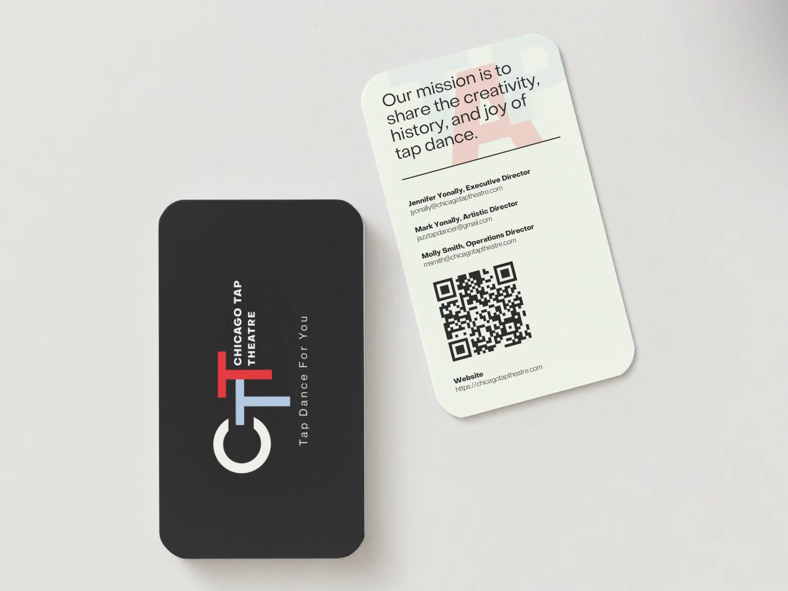
Our mission is to share the creativity, history, and joy of tap dance.
LOGO
Chicago Tap Theatre logo is minimal and modern and embodies the prestige of tap dance. The contemporary sans-serif typeface offers directness while being multifunctional. The staggered letter placement is a joyous play on the rhythm and sound of tap.
COLOR PALETTE
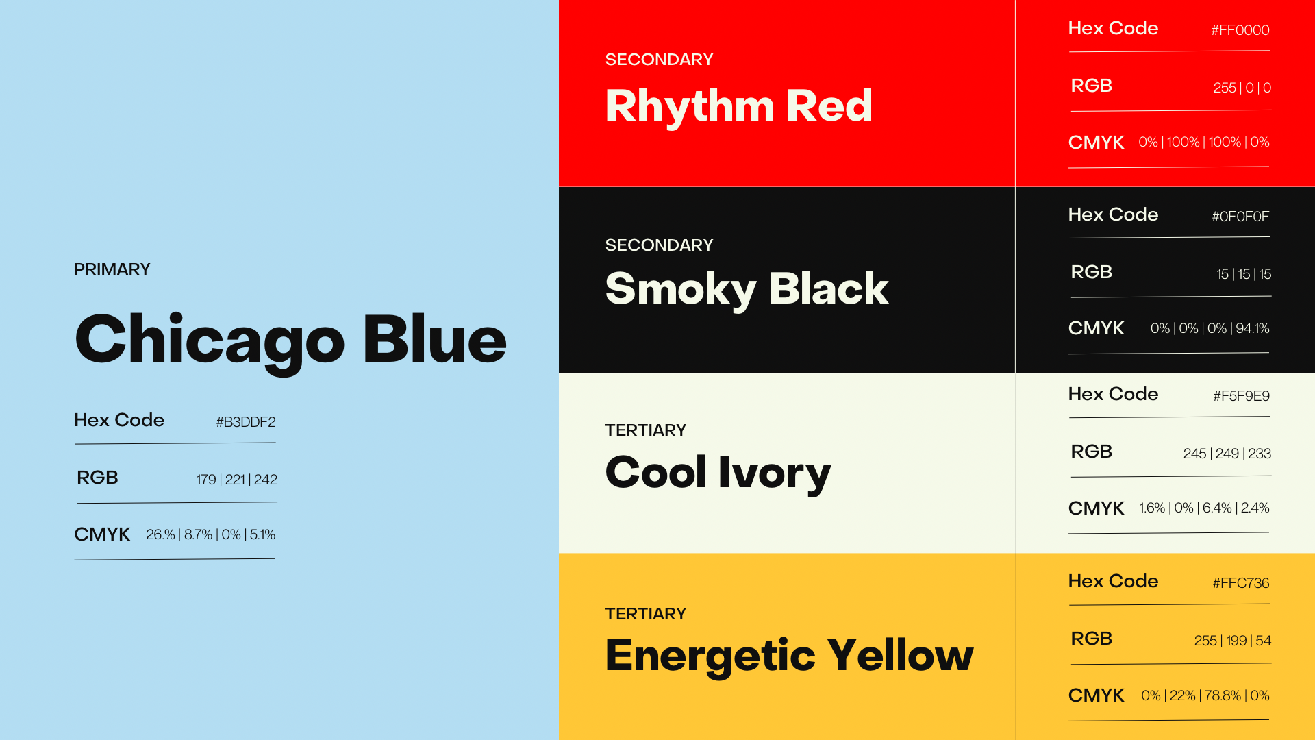
The Chicago Tap Theatre brand is underpinned with a color palette designed to be distinctive while representing the heart of Chicago and the joyous and energetic spirit of tap dance.
TYPOGRAPHY
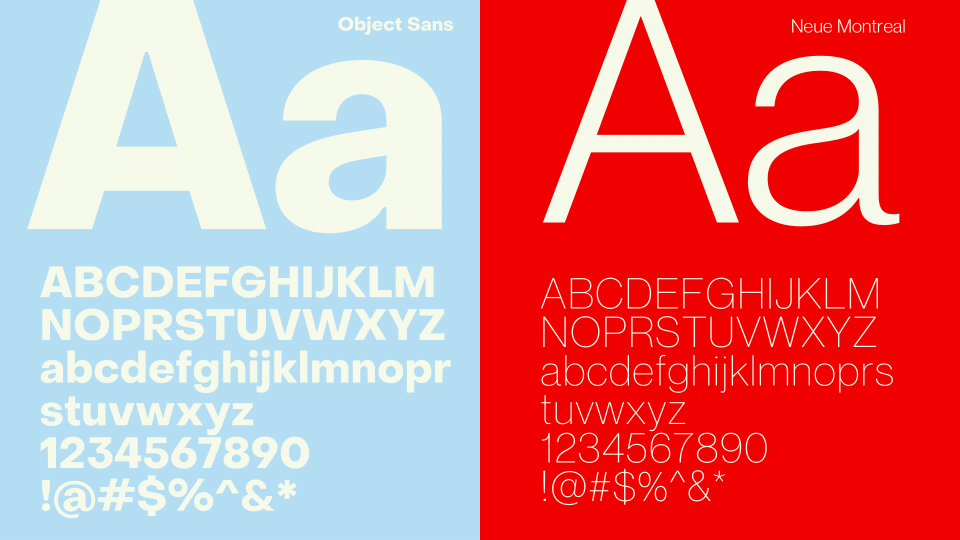
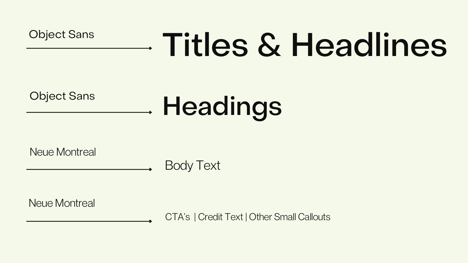
The font family employed by Chicago Tap Theatre features a selection of sans-serif typefaces. These contemporary and timeless fonts convey an elevated essence, perfectly capturing the trajectory of Chicago Tap Theatre as a company.
PRINT AND DIGITAL
WEB DESIGN AND GUIDELINES
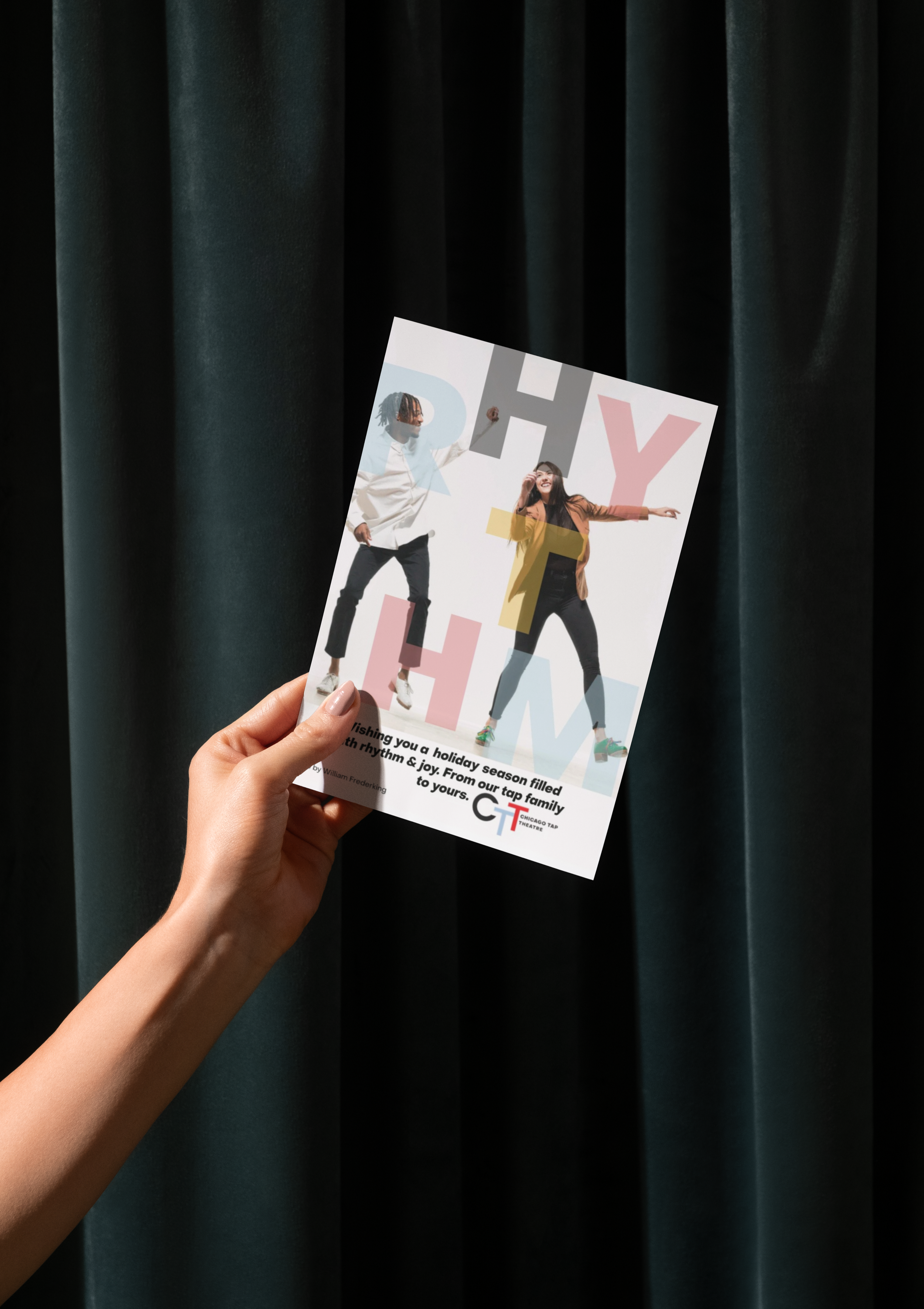
HOLIDAY CARD
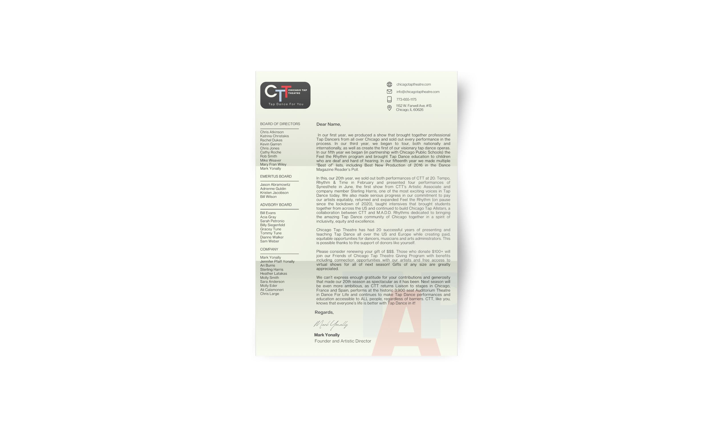
LETTERHEAD
BUSINESS CARD

